Logos and uniforms of the New York Mets
The New York Mets, founded in 1962, returned National League baseball to New York following the departure of the Brooklyn Dodgers to Los Angeles and the New York Giants to San Francisco. The Mets' uniform was designed to incorporate elements of both departed clubs, with the Dodgers' royal blue becoming the Mets' primary color and the Giants' orange the trim color, along with the Giants' "NY" crest adopted as the new team's cap logo.[1] The original Mets uniform had a "clean and classic"[2] look that, while it has undergone a number of changes over the course of the team's history, has never been substantially revised. The basic template has always been a conventional short-sleeved baseball uniform with "Mets" in script on a white pinstriped home jersey, and either "NEW YORK" or "Mets" on a gray road jersey. The most notable variations were the "racing stripe" uniforms of the 1980s and early '90s, and the addition of black as a trim color along with black alternate jerseys and caps that were worn from 1998 through 2011. For 2012, in recognition of its 50th Anniversary, the club restored its classic look by removing the black trim from all of its uniforms and phasing out the black jerseys and caps.
Primary logo
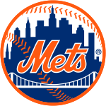
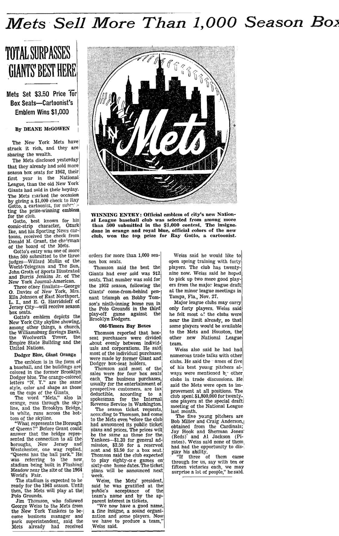
The Mets' primary logo is a circular crest with an orange outline, containing a blue silhouetted representation of New York City's skyline against a white background, with the word "Mets" in orange cursive script outlined in white just below the center of the circle. At the bottom of the circle is a generic image of a suspension bridge in white, symbolizing the joining of New York's five boroughs. The skyline itself includes, from left to right, representations of a church spire (symbolizing Brooklyn, the "borough of churches"), the Williamsburgh Savings Bank building (tallest building in Brooklyn), the Woolworth Building, the Empire State Building, and the United Nations building. Superimposed over the skyline behind the "Mets" script are orange baseball stitches.[3] The logo was designed by cartoonist Ray Gotto, creator of the Ozark Ike comic strip.[4]
From 1962–1998, the logo had a small interlocking "NY" in block letters just to the left of the "Mets" wordmark.[5]
In 1999, an alternate version of the Mets' primary logo was introduced. The skyline is depicted in black instead of blue, and the "Mets" script is blue outlined in white with an orange drop-shadow.[6] This version of the logo was to be phased out after 2012 but still appears in some locations at Citi Field.
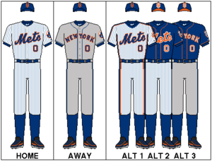
Home uniforms
The primary home uniform for the Mets is a white uniform with blue pinstripes, a conventional button-down jersey with short sleeves, and tackle-twill lettering in royal blue outlined in orange. The jersey has the word "Mets" in cursive script across the chest, angled upward, with the player's number in sans-serif block numerals underneath the "-ets" script on the player's left side.[7][8] On the back of the jersey is the player's number in sans-serif block numerals, with the player's name radially arched above it in block lettering, sewn directly onto the jersey. On the left sleeve is a circular embroidered patch depicting the Mets' primary logo.
The Mets' home uniforms are worn with blue socks, belts, and undersleeves.
Road uniforms
The road uniforms are grey with blue piping on the placket and sleeve ends. Like the home uniforms, the road jerseys have blue tackle-twill lettering outlined in orange. The uniform pants are grey with blue piping from the beltline to the cuff on each side. The "NEW YORK" wordmark is radially arched across the chest, in Tiffany typeface, with the player's number below "YORK" on the player's left side.[9][10] The road jerseys feature the same numerals, lettering and sleeve patch(es) as the home jersey, and the uniforms are also worn with blue socks, belts, and undersleeves.
Caps
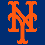
The Mets' cap, worn at home and on the road, is blue with an orange interlocking "NY" crest on the front panel, and an orange button on top of the crown.[11] The curlicue-style crest is essentially the same as that used by the New York Giants before that franchise relocated to San Francisco following the 1957 season.[12]
The Mets' batting helmets match the primary cap in color and design.
Alternate uniforms
The Mets have two blue alternate jerseys, one home and one road, that were added in 2013.[13] The home version has orange piping on the placket and sleeves resembling the road uniform, orange "Mets" script, numerals and lettering with white outline. The road version has a silver-grey "NEW YORK" wordmark, numerals and lettering with orange outline, and orange piping. In 2014, these jerseys were each given a patch on the left sleeve depicting the club's mascot, Mr. Met, in a running pose facing the front of the jersey.
The Mets' home alternate cap has a blue crown, orange bill, and the "NY" logo crest in orange outlined in white. The team added a road alternate cap for the 2015 season, which has a blue crown and bill, and "NY" logo crest in silver-grey outlined in orange. The alternate caps have no corresponding alternate batting helmets; the team's standard batting helmets matching the primary caps are used in all games.
For 2016, in recognition of the 30th Anniversary of the club's 1986 World Series championship, the Mets wore replicas of their 1986 home uniforms in Sunday home games throughout the regular season.[14] This uniform is white with blue pinstripes, a pullover jersey with "Mets" script, numerals and lettering similar to the current style, a blue V-neck collar, and thick "racing stripes" (blue with orange borders) on the shoulders from collar to sleeve cuff, on the sides of the jersey from armpit to hip, and on the sides of the pants from beltline to cuff. The 1986 jerseys had a patch on the left sleeve commemorating the franchise's 25th season, which was duplicated on the "throwback" jerseys.
Jackets
The Mets jackets for the dugout and bullpen are blue with an orange interlocking-"NY" logo on the left chest.
Uniform History

The original Mets uniforms from 1962 were of essentially the same design as the team's current primary home and road uniforms.[15] The home uniform was white with blue pinstripes, "Mets" script in blue outlined in orange across the chest, with the player's number on the back of the jersey in blue block numerals outlined in orange, but no player name on the back and no numerals on the front. The cap was blue with the orange "NY" crest on the front panel, the same as the current cap but with a blue button on top of the crown. The road uniform also resembled the current road grays, except with no player name on the back and no numerals on the front. The primary logo appeared as a patch on the left sleeve of the road jersey in 1962, added to the home jersey in 1963.
Apart from the addition of numerals to the front of the jerseys in 1965,[16] underneath the wordmark on the player's left side, and some variations to the numeral typeface, this uniform remained largely unchanged through 1973.[17][18] A special World's Fair patch was worn on the left sleeve in 1964 and '65, in place of the Mets' primary logo.[19][20] In 1969 the logo patch was supplanted by a patch commemorating the 100th Anniversary of Major League Baseball.[21]
In 1974, the "Mets" script replaced the "NEW YORK" wordmark on the road jersey. The home uniform was unchanged.[22][23]
On a few occasions in 1976, the Mets wore special "pillbox" caps that had a cylindrical (as opposed to hemispherical) crown and three thin orange horizontal stripes across the front.[24][25]
In 1978, the home and road jerseys changed from conventional button-down jerseys to pullover jerseys, with two buttons just below the collar. The blue piping was removed from the road jerseys. Three thin stripes (blue-orange-blue) were added to the sleeve cuffs and collar on both home and road jerseys.[26][27]
In 1979, player names were added to the back of the jerseys, radially arched above the number in blue block letters outlined in orange. The letters were sewn onto an arched fabric "nameplate" (white on the home jerseys, grey on the road jerseys) that was in turn sewn onto the jersey itself.[28]

In 1982, the primary logo patch was removed from the left sleeve of the road jerseys, to which were added thick "racing stripes" (blue with orange borders) on the shoulders from neck to sleeve cuff, on the sides of the jerseys from armpit to hip, and on the sides of the pants from beltline to cuff; the collar and sleeve-cuff striping were removed.[29] The two-button collar was replaced by a v-neck.[30] The "racing stripes" and a blue v-neck collar were added to the home uniforms in 1983.[31][32]
From 1982–84, the team occasionally wore blue alternate jerseys on the road. The 1982 blue jersey, worn only rarely, had the "Mets" script, numerals and lettering in orange with grey outline, and orange-blue-orange striping on the collar and sleeve cuffs.[33] For 1983–84, the road blue alternate had the "Mets" script, numerals and lettering in grey with orange outline, and orange-white-orange collar and sleeve striping.[34]
In 1986, the team wore a special 25th Anniversary patch on the left sleeve.[35][36]
In 1987, the "nameplates" were eliminated and the letters of the players' names were sewn directly onto the jerseys.[37] The "Mets" script on the road jersey was replaced with "New York" in cursive script.[38] This was replaced in 1988 by "NEW YORK" in radially-arched block letters with no player numerals on the front of the jersey.[39] Also in 1988, a thin white outline was added to the wordmark, numerals, lettering, and "racing stripes" on the road jerseys.[40]
In 1991, the pullover jerseys were replaced by button-down jerseys, and thin white outline was added to the wordmark, numerals and lettering on the home jerseys.[41][42]
In 1992, the team wore a patch on the left sleeve, consisting of a white circle with black outline, pinstripes and letter "S" in honor of the late William A. Shea, the New York attorney for whom Shea Stadium was named.[43][44]

In 1993, the color blue used on the Mets uniforms was changed to a slightly darker shade. The "racing stripes" were removed from both home and road uniforms, and the primary logo returned to the left sleeve. The "Mets" script on the home jersey was modified, and for the first time incorporated a "swoosh-tail" attached to the letter "s" underlining the wordmark. The road jersey had "New York" in cursive script, similar but not identical to the script used in 1987, and also with a "swoosh-tail" attached to the letter "k" underlining the wordmark. The road uniform had thin blue-orange-blue piping on the sleeve cuffs and on the sides of the pants from beltline to cuff.[45] In 1994, player numerals were added to the front of the road jersey, below the wordmark on the player's left side, and the piping was removed from the road uniform.[46] Also in 1994, the primary-logo sleeve patch was modified to incorporate rectangular spaces above and below the circle, containing text commemorating the 25th anniversary of the 1969 "Miracle Mets."[47] On the right sleeve was a patch, worn league-wide, commemorating the 125th Anniversary of Major League Baseball.
The Mets returned to their traditional uniform design in 1995. The original "Mets" script was restored to the home jersey, the original "NEW YORK" wordmark was restored to the road jersey along with the original blue piping, and the white outline was removed from the wordmark, numerals and lettering on the road jersey. The original shade of blue was also restored to the entire uniform.[48]
In 1997, the Mets introduced an alternate home uniform that was plain white with no pinstripes, and blue piping matching the road uniform.[49][50] The team also introduced an alternate cap with a white crown and blue bill. The "NY" crest on the alternate cap was blue with an orange outline.[51] The white cap was worn with the white alternate jersey on some occasions early in the season. Also in 1997, the team wore a patch on the right sleeve of all three jerseys commemorating the 50th anniversary of Jackie Robinson's breaking of Major League Baseball's color barrier.
In 1998, a black alternate jersey was introduced, matching the white home alternate in style but with the "Mets" script, numerals and lettering in blue with white outline and orange drop-shadow.[52] The black jersey was worn as an alternate in both home (with the white home alternate pants) and road (with the road gray pants) games.[53] The team also introduced a black alternate cap with blue bill, and "NY" crest in blue outlined in orange, to be worn with the black jerseys.[54] The white alternate cap from 1997 was discontinued. A black drop-shadow was added to the script, numerals and lettering on the home white alternate[55][56] and road gray[57][58] jerseys.
In 1999, a road version of the black alternate jersey (with the "NEW YORK" wordmark) was introduced.[59] An alternate version of the Mets' primary logo, with a black skyline and "Mets" script in blue outlined in white with orange drop-shadow, was introduced in 1999 and worn on the left sleeve of both black alternate jerseys. A second black alternate cap was added, to be worn with both black alternate jerseys, this one with a black bill and "NY" crest in blue outlined in white with orange drop-shadow (matching the script, numerals and lettering on the black alternate jerseys).[60] This became commonly known as the "solid black cap" or "all-black cap" while the 1998 black alternate cap, which was retained, became known as the "two-tone cap" or "hybrid cap" thanks to its blue bill. Also in 1999, a black drop-shadow was added to the script, numerals and lettering on the home pinstriped uniforms,[61][62] and player names were removed from the back of all three home jerseys.
Although the Mets continued to officially designate the pinstriped uniform as the club's primary home uniform, and the blue cap with orange crest as the primary cap,[63] the reality of what was worn on the field from 1998 through 2009 was quite different. At some point during the 1998 season, the team began occasionally pairing the two-tone cap, which was designed to be worn with the black jerseys, with the white alternate jerseys and gray road uniforms as well. By the end of the 1998 season the two-tone cap had become the team's de facto road cap and was frequently worn at home with the white alternates as well as the black, but not with the pinstripes which still had no black trim. After 1998, the blue cap was worn only rarely and exclusively at home; the road gray jerseys were paired exclusively (except for one game in 2008) with the two-tone cap, and the black jerseys were paired exclusively with the all-black cap. All of the uniforms were worn with black socks, belts and undersleeves, except when the blue cap was worn in which cases the accessories were blue. Although the home pinstriped and white uniforms were paired at various times with all three caps, in most home games during this period the team wore the white alternate uniform with the two-tone cap. Beginning in 2001, when the two-tone cap was designated as the official road cap, until it was discontinued after the 2011 season, the Mets were the only team in MLB to wear its designated road cap at home.
In 2000, player names were returned to the back of the three home jerseys.
In 2001, following the terrorist attacks of September 11, when play resumed and for the balance of the season all MLB teams including the Mets had an American flag patch sewn onto the back of the collar of all game jerseys. The Mets added embroidery to the right sleeve cuff of all five jerseys showing the phrase "9-11-01" flanked by two American flags. In addition, beginning September 21 at their first home game after the attacks, the Mets wore caps of New York City's first-responder agencies—the Police Department (NYPD), Fire Department (FDNY), and Port Authority Police (PAPD)—in place of their regular game caps. The Mets were only permitted to wear these caps during pre-game warmups on September 21 but defied MLB instructions and wore them in game play, that night and for the remainder of the season. All of the first-responder caps were navy blue, with either "NYPD" in white serif lettering, "FDNY" in thick yellow-orange-red gradient lettering, or the PAPD shield logo on the front. Typically, each player and coach chose one of the three caps and wore that same one for the balance of the season.
In 2002, the Mets wore a patch on the right sleeve commemorating the club's 40th Anniversary.[64] The "9-11-01" sleeve embroidery was carried over from the previous season.
In 2004, the Mets wore a patch on the right sleeve commemorating the 40th Anniversary of Shea Stadium.[65] Below this patch, embroidered onto the sleeve in black lettering on the pinstriped, white and gray jerseys and white lettering on the black jerseys, was the phrase "Ya Gotta Believe" and the name "TUG", in honor of former Mets pitcher Tug McGraw who died on January 5. Also in 2004, the name of longtime Mets broadcaster Bob Murphy was embroidered on the left sleeve above the primary logo patch after Murphy died on August 3.[66]
Prior to 2006, throughout Mets history, the team's batting helmets were designed to match the caps. The 1997 white alternate cap had no corresponding batting helmet, although first baseman John Olerud wore a white helmet on the field; the team used its standard batting helmets (matching the blue caps) in all games. Beginning in 1998, each alternate cap had a matching corresponding batting helmet with the same crown and bill colors, and the same "NY" logo crest applied as a decal on the front of the helmet. In 2006, however, the club began using the Rawlings Coolflo batting helmet, and changed the design of the helmet paired with the two-tone cap such that the cap and helmet no longer matched. The helmet shell was black; the bill and the front of the crown were painted metallic blue, the area of which conformed to the surface contours of the helmet shell and faded gradually toward the back. The "NY" crest on the front of this helmet was black with white outline and orange drop-shadow. The blue and all-black helmets received the same metallic paint treatment as the two-tone helmet, but still essentially matched the respective caps as the metallic paint was the same color as the helmet shell and the "NY" logo decals matched the crests on the corresponding caps.
In 2008, the Mets wore a patch on the right sleeve denoting the final season of Shea Stadium.[67] For the team's final home series at Shea in late September, the patch was embroidered on the left side of the caps. Also in 2008, for the first game of a doubleheader on June 28 against the Yankees at Yankee Stadium, the Mets wore blue caps and accessories with the road gray uniforms for the first time since 1998. This combination would not appear again until the black trim, caps and accessories were eliminated for the 2012 season.
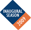
In 2009, the Mets wore a patch on the right sleeve to mark the opening of their new ballpark, Citi Field.[68] A different Inaugural Season logo for Citi Field was embroidered on the left side of the caps.[69] Neither logo patch contained the name of the ballpark, in deference to MLB rules prohibiting corporate names or logos (other than those of the uniform manufacturer) from appearing on the uniform; similar logos containing the name "Citi Field" were designed and used in publications, signage and other contexts.[70][71] Also in 2009, the road ("NEW YORK") version of the black alternate jersey was discontinued, although the home ("Mets") version continued to be worn as an alternate in road games as well as at home.[72]
In 2010, the home white alternate uniform was re-designated as the primary home uniform.[73] The pinstriped uniform was designated as an alternate, and the fabric color changed from white to off-white.[74] This uniform was paired exclusively with the blue cap, which was still the designated home cap and was worn somewhat more often in 2010 and 2011 than it had been from 1998–2009, but still only at home.
In 2012, the black drop-shadow was removed from all of the team's jerseys, and the two-tone cap was discontinued. The off-white pinstriped uniforms became the primary home uniform,[75] the white uniforms became the home alternate,[76] and the blue cap with orange crest became the sole uniform cap for both home and road games.[77] The metallic paint treatment on the batting helmets was discontinued. The black jerseys and all-black caps were retained but worn only twice, an occasions honoring former players Edgardo Alfonzo and John Franco who wore them during significant portions of their Mets careers.[78] A special 50th Anniversary logo patch supplanted the primary logo patch on the left sleeve of the home, alternate and road jerseys, was added to the right sleeve of the black jerseys, and was also embroidered on the back of the caps.[79] A memorial patch for former Mets catcher and Hall of Famer Gary Carter was worn on the right sleeve of the home, alternate and road jerseys, and on the front of the black jerseys by the player's right shoulder. This patch was black, in the shape of home plate, with "KID" (Carter's nickname) above "8" (Carter's number) in white lettering.
In 2013, the Mets hosted the All-Star Game, and wore a corresponding logo patch on the left sleeve of their jerseys, supplanting the primary logo for another year. The team also added blue home and road alternate jerseys to its uniform rotation. The blue home jersey has the "Mets" script, numerals and lettering in orange outlined in white, and orange placket and sleeve piping. The road version has the "NEW YORK" wordmark, numerals and lettering in grey outlined in orange. Also in 2013, the club introduced an alternate cap with a blue crown, orange bill, and "NY" logo crest in orange outlined in white, but with no corresponding alternate batting helmet. This alternate cap was worn occasionally at home, with either the blue or white alternate jerseys. The black alternate jerseys were not worn at all in 2013, despite indications that the club might retain them for special occasions as it did in 2012, and thus were finally phased out.
In 2014, the blue alternate jerseys were given a new left-sleeve patch depicting the Mets' mascot, "Mr. Met", in a running pose facing to the left of the viewer toward the front of the jersey.[80] The primary-logo patch returned to the left sleeve of the home pinstriped, white alternate and road gray jerseys after being supplanted for two years. Also in 2014, the Mets wore a patch on the right sleeve of all five jerseys honoring former longtime Mets broadcaster and baseball Hall of Famer Ralph Kiner, who died on February 6.[81] The patch was a black circle with silver border and lettering, depicting a microphone at center with the name "RALPH KINER" circumscribed above and "1922–2014" below.
In addition, the Mets introduced a military-camouflage alternate jersey for 2014, to be worn in select Monday home games.[82] This jersey had the regular home "Mets" script and numerals with no piping, and an American flag patch in place of the primary logo on the left sleeve. It was worn with a matching camouflage cap, with the "NY" logo crest in blue outlined in orange.[83]
In September 2014, a revised version of the Mets' primary logo began to appear on the club's social media accounts, substituting the Citigroup Center for the United Nations building on the right side of the skyline. The club subsequently announced that the primary logo was not changing and the accounts reverted to the proper logo.[84]
In 2015, the Mets changed the fabric color of the home pinstriped uniforms from off-white to white, and discontinued the white home alternate uniform. The club also added an alternate road cap, with a blue crown and bill and the "NY" logo in silver-grey outlined in orange, matching the road blue alternate jersey; as with the home alternate cap, there is no corresponding alternate batting helmet.
In 2016, the Mets wore 1986 "throwback" uniforms in every Sunday home game, to mark the 30th anniversary of the club's last world championship.[85] The uniform featured the same pullover jersey, "racing stripes", and commemorative patch worn in 1986. The Mets did not wear the military-camouflage alternate jerseys in 2016.[86]
"Throwbacks" and Special Uniforms
The Mets wore their first "throwback" (or "Turn Back the Clock") uniform, a 1962 replica, for a game against the Cincinnati Reds at Shea Stadium on August 30, 1992.[87] The jerseys had the primary-logo patch on the left sleeve even though it was not actually used on the home jersey in the Mets' inaugural season.
In 1999, the Mets wore gray flannel 1969 replica uniforms for a road game against the Tampa Bay Devil Rays on July 17.[88] Ten days later, as part of an MLB-wide "Turn Ahead the Clock" promotion, futuristic uniforms appeared in a home game against the Pittsburgh Pirates.[89] These uniforms branded the team as the "Mercury Mets" in reference to the planet Mercury, and featured black caps with the planetary symbol (![]() ) in silver as the team's logo. The jerseys were black with silver truncated sleeve openings, and had the word "Mercury" in silver appearing horizontally across the top of the chest with "METS" in vertically-stacked capitals on the player's left side. Below the word "Mercury" on the player's right side was an image of the
) in silver as the team's logo. The jerseys were black with silver truncated sleeve openings, and had the word "Mercury" in silver appearing horizontally across the top of the chest with "METS" in vertically-stacked capitals on the player's left side. Below the word "Mercury" on the player's right side was an image of the ![]() symbol hovering above and casting its shadow upon a generic gray cratered planetoid. On the back of the jersey, the player's name and number were rendered in silver, with the player's name to the right of the number written vertically from top to bottom.
symbol hovering above and casting its shadow upon a generic gray cratered planetoid. On the back of the jersey, the player's name and number were rendered in silver, with the player's name to the right of the number written vertically from top to bottom.
A 1969 "throwback" uniform was worn on April 25, 2000, for a home game against the Cincinnati Reds.[90]
On July 16, 2001, for a home game against the Toronto Blue Jays, the Mets wore replica uniforms of the 1947 New York Cubans of the Negro Leagues.[91] These uniforms were white with red piping on the placket, shoulders, sleeve cuffs and pants. Across the chest was "NEW YORK" in red lettering, angled upward, above a black silhouetted baseball bat, with "CUBANS" inscribed horizontally underneath with the letter "C" encircling the end of the bat. The caps were black with a red bill and the Mets' "NY" crest in red. The Mets would dress as the Cubans again for Negro League tribute games in subsequent seasons. On June 13, 2004 at Kansas City, July 9, 2005 at Pittsburgh, and August 11, 2006 at Washington, they appeared as the 1944 Cubans in gray uniforms with black piping on the placket, sleeve cuffs and pants, "NEW YORK" in red in radially-arched sans-serif capitals across the chest, and "CUBANS" in vertically-stacked capitals on the left sleeve.[92] The caps were black with a red bill and the "NY" crest in red outlined in white. These were worn again, without the white outline on the cap logo, on May 29, 2010 at Pittsburgh.[93] Later that season, on August 21 at Milwaukee, the Mets wore a Cubans uniform that was gray with red piping, red cap, and lettering resembling the 1947 version worn in 2001, as described above.[94]
In 2002, the Mets wore 1986 replica uniforms for home games against the Florida Marlins on July 15 and 16.[95] The uniforms featured pullover jerseys with "racing stripes" similar to the 1983–1990 style, but without the 25th-Anniversary sleeve patch worn in 1986. On August 19 and 20, 2006, the Mets again wore 1986 replicas, this time with the 25th-Anniversary sleeve patch, at Shea Stadium against the Colorado Rockies.
From 2007–2014, the Mets celebrated "Hispanic Heritage Night" once each season with a special jersey, featuring the phrase "Los Mets" in place of the traditional "Mets" wordmark. From 2007–09, the "Los" was simply added to the home white alternate jersey in miniature cursive script, blue with orange outline and black drop-shadow, just above and to the left (from the viewer's perspective) of the "M" in "Mets"; in 2010 they did the same with the home pinstriped jerseys.[96] In 2011, the team created an alternate jersey that was blue with orange placket piping, orange numerals and lettering outlined in white, a "Los Mets" wordmark in cursive script across the chest, angled upward, with "Los" on the player's right placket and "Mets" on the left above the numeral.[97] In 2012 the blue jersey was used again, this time with white numerals and lettering outlined in orange.[98] The 2013 "Los Mets" jersey was orange, with blue lettering outlined in white and blue piping, worn with the home alternate cap and the All-Star Game patch on the left sleeve.[99] The orange "Los Mets" jersey returned in 2014, this time with the standard cap and the "Mr. Met" sleeve patch.[100]
In 2009, for three games in mid-August against the San Francisco Giants at Citi Field, the Mets wore a "fauxback" (i.e., resembling the past or a particular era in style but not matching an actual previous uniform) designed to honor the old New York Giants.[101][102] The uniform was off-white/cream-colored and displayed the letters "N Y" in large thick royal-blue capitals, in Tiffany typeface, on the front of the jersey on either side of the placket, with plain blue serif block numerals on the back. On the right sleeve was a patch depicting the team's mascot, "Mr. Met", in a running pose facing to the right of the viewer toward the front of the uniform. The jersey had thin blue-orange-blue striping around the collar and sleeve cuffs, and the pants had thin blue piping down the sides from hip to cuff. This uniform was worn with the Mets' standard blue caps and helmets, blue socks and undersleeves, and black belts.
The Mets wore replicas of their 1989 road uniforms for a game at San Diego on August 3, 2012, adding the 2012 Gary Carter memorial patch to the right sleeve of the "throwback" jersey.
On April 16, 2013, the Mets wore replicas of their 1993 home uniforms in the second game of a doubleheader against the Colorado Rockies at Coors Field. Although the Mets were the visitors, the Rockies were commemorating the first game in franchise history which took place at Shea Stadium on April 5, 1993, so the Rockies wore their road uniforms from that game for the occasion.
In 2014, the Mets once again paid tribute to the Negro Leagues, this time as the Brooklyn Royal Giants for a game at Pittsburgh on June 28.[103] The uniforms were royal blue with orange piping on the shoulders, sleeves and pants, and "ROYAL GIANTS" in thick orange capitals across the chest ("ROYAL" above "GIANTS"). The caps were also royal blue, with a large interlocking "RG" crest in orange. The jerseys had a circular patch on the left sleeve, the top part showing the orange "RG" logo on a blue background and the bottom part showing "ROYAL GIANTS" in serif capitals above "Brooklyn" in italic script, on a white background. These uniforms appeared again on June 20, 2015 and June 25, 2016, at Atlanta.[104]
On July 20, 2016, the Mets wore replicas of their 1986 road uniforms for a game against the Chicago Cubs at Wrigley Field.
References
- ↑ Okkonen, Marc. Baseball Uniforms of the 20th Century. Sterling Publishing Co., Inc., 1993, p.53.
- ↑ Id.
- ↑ http://www.sportslogos.net/logo.php?id=m01gfgeorgvbfw15fy04alujm
- ↑ http://farm7.static.flickr.com/6235/6350915675_0cc954827d_o.png
- ↑ http://www.sportslogos.net/logo.php?id=34fklmt62f7bpq20uisaruz8d
- ↑ http://www.sportslogos.net/logo.php?id=nuudzbqeegyh2w4vef9q6025s
- ↑ http://www.sportslogos.net/logo.php?id=y8vb6gzgeox3g6gzfg6n2k0om
- ↑ http://www.sportslogos.net/logo.php?id=ygndfm8a60ogunfbh55rztzph
- ↑ http://www.sportslogos.net/logo.php?id=0soejzwx3o2xfshohg21xyqv1
- ↑ http://www.sportslogos.net/logo.php?id=rifmozd3zmuvgev6kbf3yykbe
- ↑ http://www.sportslogos.net/logo.php?id=hx1e7lwmayecgb6h4gg5t4rz6
- ↑ http://www.sportslogos.net/logo.php?id=1218
- ↑ http://metsblog.com/metsblog/photo-johansantana-in-the-mets-new-blue-jersey-for-2013/
- ↑ http://m.mets.mlb.com/news/article/165118448/mets-to-wear-throwback-uniform-on-home-sundays
- ↑ http://exhibits.baseballhalloffame.org/dressed_to_the_nines/detail_page.asp?fileName=nl_1962_newyork.gif&Entryid=1000
- ↑ http://exhibits.baseballhalloffame.org/dressed_to_the_nines/detail_page.asp?fileName=nl_1965_newyork.gif&Entryid=1060
- ↑ http://exhibits.baseballhalloffame.org/dressed_to_the_nines/uniforms.asp?league=NL&city=New+York&lowYear=1962&highYear=&sort=year&increment=18
- ↑ William F. Henderson, Game-Worn MLB Jersey Guide, 6th Ed. (2012), pp.1182-85.
- ↑ http://exhibits.baseballhalloffame.org/dressed_to_the_nines/detail_page.asp?fileName=nl_1964_newyork.gif&Entryid=1040
- ↑ http://www.sportslogos.net/logo.php?id=1221
- ↑ http://exhibits.baseballhalloffame.org/dressed_to_the_nines/detail_page.asp?fileName=nl_1969_newyork.gif&Entryid=1141
- ↑ http://exhibits.baseballhalloffame.org/dressed_to_the_nines/detail_page.asp?fileName=nl_1974_newyork.gif&Entryid=1262
- ↑ Henderson, p. 1186.
- ↑ http://exhibits.baseballhalloffame.org/dressed_to_the_nines/detail_page.asp?fileName=nl_1976_newyork.gif&Entryid=1310
- ↑ http://metspolice.com/2010/08/06/the-1976-new-york-mets-pillbox-caps/
- ↑ http://exhibits.baseballhalloffame.org/dressed_to_the_nines/detail_page.asp?fileName=nl_1978_newyork.gif&Entryid=1360
- ↑ Henderson, pp. 1187-88.
- ↑ Id.
- ↑ Henderson, pp. 1187-89.
- ↑ http://exhibits.baseballhalloffame.org/dressed_to_the_nines/detail_page.asp?fileName=nl_1982_newyork.gif&Entryid=1464
- ↑ http://exhibits.baseballhalloffame.org/dressed_to_the_nines/detail_page.asp?fileName=nl_1983_newyork.gif&Entryid=1490
- ↑ Henderson, p. 1191.
- ↑ Henderson, p. 1190.
- ↑ Id., p. 1193.
- ↑ http://exhibits.baseballhalloffame.org/dressed_to_the_nines/detail_page.asp?fileName=nl_1986_newyork.gif&Entryid=1568
- ↑ http://www.sportslogos.net/logo.php?id=1224
- ↑ Henderson, p. 1194.
- ↑ http://exhibits.baseballhalloffame.org/dressed_to_the_nines/detail_page.asp?fileName=nl_1987_newyork.gif&Entryid=1594
- ↑ http://exhibits.baseballhalloffame.org/dressed_to_the_nines/detail_page.asp?fileName=nl_1988_newyork.gif&Entryid=1620
- ↑ Henderson, p. 1195.
- ↑ http://exhibits.baseballhalloffame.org/dressed_to_the_nines/detail_page.asp?fileName=nl_1991_newyork.gif&Entryid=1698
- ↑ Henderson, p. 1196.
- ↑ http://exhibits.baseballhalloffame.org/dressed_to_the_nines/detail_page.asp?fileName=nl_1992_newyork.gif&Entryid=1724
- ↑ http://www.sportslogos.net/logo.php?id=1231
- ↑ http://exhibits.baseballhalloffame.org/dressed_to_the_nines/detail_page.asp?fileName=nl_1993_newyork.gif&Entryid=1752
- ↑ http://exhibits.baseballhalloffame.org/dressed_to_the_nines/detail_page.asp?fileName=nl_1994_newyork.gif&Entryid=1780
- ↑ http://www.sportslogos.net/logo.php?id=1223
- ↑ http://exhibits.baseballhalloffame.org/dressed_to_the_nines/detail_page.asp?fileName=nl_1995_newyork.gif&Entryid=1808
- ↑ http://www.sportslogos.net/logo.php?id=kqbrnd53la8htx8afu59fbhlj
- ↑ http://www.sportslogos.net/logo.php?id=4m3ufkqiv0g0x5fp2fxbftkos
- ↑ http://www.sportslogos.net/logo.php?id=kqbrnd53la8htx8afu59fbhlj
- ↑ http://www.sportslogos.net/logo.php?id=4664ro0r23zashsa4bicgdbyd
- ↑ http://www.sportslogos.net/logo.php?id=x8sabrg99ak2y3xkdsu77fp7t
- ↑ http://www.sportslogos.net/logo.php?id=2fzfet2h7vllqzdgoowrpq0th
- ↑ http://www.sportslogos.net/logo.php?id=erglfazxbhqqn570ppigaavhk
- ↑ http://www.sportslogos.net/logo.php?id=vjn04npmgrtsd1pqqbl8g4zep
- ↑ http://www.sportslogos.net/logo.php?id=huhnrpawu15y8j15huqyhq5oo
- ↑ http://www.sportslogos.net/logo.php?id=pgxlo0eqay3eek4eciepec3xb
- ↑ http://www.sportslogos.net/logo.php?id=fnwlzpyq69t32gkgv2mhhfs0c
- ↑ http://www.sportslogos.net/logo.php?id=qrdvae6hg5ah4ggze7q2def4s
- ↑ http://www.sportslogos.net/logo.php?id=f11tueeh9gt82rg8cu6mae9og
- ↑ http://www.sportslogos.net/logo.php?id=brvfshgi3h9nmvzhqos0r2rg2
- ↑ http://exhibits.baseballhalloffame.org/dressed_to_the_nines/detail_page.asp?fileName=nl_2000_newyork.gif&Entryid=1959
- ↑ http://www.sportslogos.net/logo.php?id=k2t3gqanaggh5pkozl2cr41lw
- ↑ http://www.sportslogos.net/logo.php?id=oba4m4pg4fkh2gofjdyeqbirn
- ↑ http://www.sportslogos.net/logo.php?id=2137M
- ↑ http://www.sportslogos.net/logo.php?id=qpp433pjnuen8dzdcez3y9qto
- ↑ http://www.sportslogos.net/logo.php?id=1h0ehpf44hh7w0df1qbz7rbq8
- ↑ http://www.sportslogos.net/logo.php?id=ztnexskxt70chs4j8si5xy9im
- ↑ http://www.sportslogos.net/logo.php?id=xk0ki4gikg69qfjm0n22hlcn1
- ↑ http://www.sportslogos.net/logo.php?id=w2nphnk23jsftg3ogic3f6g2e
- ↑ http://sports.espn.go.com/espn/page2/story?page=lukas/090402
- ↑ http://exhibits.baseballhalloffame.org/dressed_to_the_nines/detail_page.asp?fileName=nl_2010_newyork.gif&Entryid=2360
- ↑ http://www.sportslogos.net/logo.php?id=f11tueeh9gt82rg8cu6mae9og
- ↑ http://exhibits.baseballhalloffame.org/dressed_to_the_nines/detail_page.asp?fileName=nl_2012_newyork.gif&Entryid=2420
- ↑ http://www.sportslogos.net/logo.php?id=4pagurzywashf3qr1kz035oxb
- ↑ http://newyork.mets.mlb.com/news/article.jsp?ymd=20111116&content_id=25983192&vkey=pr_nym&c_id=nym
- ↑ http://www.uni-watch.com/2011/11/17/mets-unveil-new-uniforms-and-finally-ditch-the-black/
- ↑ http://www.sportslogos.net/logo.php?id=hu4mere2gwshbkqrjfet81zuy
- ↑ http://espn.go.com/blog/new-york/mets/post/_/id/80267/mr-met-patch-to-adorn-blue-uniforms
- ↑ http://espn.go.com/blog/new-york/mets/post/_/id/81187/mets-to-honor-kiner-with-patch
- ↑ http://mlb.mlb.com/news/article.jsp?c_id=nym&content_id=63830206&partnerId=as_mlb_20131111_14308454&vkey=pr_nym&ymd=20131111
- ↑ http://news.sportslogos.net/2013/11/11/mets-unveil-new-camo-jersey-will-wear-5-times-in-2014/
- ↑ http://espn.go.com/blog/new-york/mets/post/_/id/95013/mets-say-no-logo-change-coming
- ↑ http://m.mets.mlb.com/news/article/165118448/mets-to-wear-throwback-uniform-on-home-sundays
- ↑ https://www.sny.tv/mets/news/mets-will-not-wear-camouflage-uniforms-in-2016/169096422
- ↑ Henderson, p. 1241.
- ↑ Henderson, p. 1242.
- ↑ Id., p. 1243.
- ↑ Henderson, p. 1244.
- ↑ Henderson, p. 1245.
- ↑ Id., p. 1247.
- ↑ Id., p. 1253.
- ↑ Id., p. 1252.
- ↑ Henderson, p. 1246.
- ↑ Henderson, pp. 1249, 1254.
- ↑ Id., p. 1255.
- ↑ http://news.sportslogos.net/2012/08/24/new-york-mets-in-los-mets-jerseys-tonight/
- ↑ http://www.sportslogos.net/logos/view/6748472013/New_York_Mets/2013/Special_Event_Uniform
- ↑ https://twitter.com/philhecken/status/510570744708079616
- ↑ http://www.mbtn.net/?p=1265
- ↑ Henderson, p. 1251.
- ↑ http://www.ajc.com/photo/sports/baseball/bright-blue-and-bright-orange-collide-mets-uniform/pCHm5m/
- ↑ http://www.app.com/story/sports/mlb/mets/2015/06/20/atlanta-braves-beat-new-york-mets/29060619/
External links
- Dressed to the Nines – National Baseball Hall of Fame
- Chris Creamer's sportslogos.net
- Uniforms
- Full Uniform History