M+ FONTS
M+ FONTS are Japanese font families designed by Coji Morishita. The 'M' stands for 'Minimum', while the plus sign means above minimum.
M+ OUTLINE FONTS
 | |
| Category | Sans Serif, Monospace |
|---|---|
| Designer(s) | Morishita, Cōji (森下 浩司) |
| Foundry | M+ FONTS PROJECT |
| Date created | 2003-11-? |
| Date released |
2003-12-? (TESTFLIGHT-001) |
| Variations |
Proportional with 7 weights from thin to black, and Monospace with 5 weights from thin to bold. Two Kana curve styles. See #Naming. |
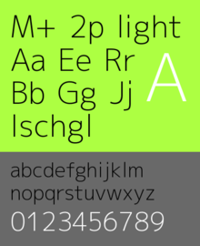
The M+ OUTLINE FONTS are sans-serif, with proportional and monospaced fonts and many different weights ranging from thin to black. The fonts support following characters sets: C0 controls and basic Latin, Latin-1 Supplement, Latin Extended-A, Japanese Kana, and Japanese Kanji.[1] The fonts are developed using FontForge.[2] The current version contains over 4600 glyphs.
Naming
A M+ outline font is named in a pattern like M+ [12](P|C|MN?)?. The numbers denote glyph design styles, while the letters denote latin glyph configurations.
- Kana & latin style numbering. Japanese glyphs are full-width. The ideographic (kanji) glyphs are identical between fonts of same weights.
- M+ 1
- Consists of contrasting straight lines and hand-drawn curves.
- M+ 2
- Incorporates traditional feature of Kana script in the overall modern sans-serif design.
- Proportional Latin fonts. Available in thin, light, regular, medium, bold, heavy, black weights:
- M+ P (1P/2P)
- aimed as sophisticated and relaxed design
- M+ C (1C/2C)
- optimized to be proportioned well in typesetting
- Fixed half-width Latin fonts. Available in thin, light, regular, medium, bold weights:
- M+ M (1M/2M)
- created to emphasize the balance of natural letterform and high legibility
- M+ MN Type-1 (1MN)
- high visibility font designed for programming use
The Latin Type-1 and Type-2 font are designed for use with M+ 1 and M+ 2 fonts respectively. Each Type-2 font has several alternative glyphs different from the respective Type-1 font.
Awards
The font family was selected as one of the "free fonts of the month" in Smashing Magazine,[3] and also selected as "Project of the Month" in SourceForge.JP.[4] It has also been selected as an excellent font among eight fonts for print and screen.[5]
M+ BITMAP FONTS
M+ BITMAP FONTS consists of raster fonts, originally developed in 2002.[6]
Font list
- Japanese and Latin: All Japanese glyphs occupy full-width cells. Fonts are made in heights of 10 and 12 pixels in regular and bold weights.
- M+ gothic: Japanese with half-width Latin glyphs.
- M+ goth_p: Japanese with proportional Latin glyphs.
- Latin only
- M+ fxd: It consists of fixed-width glyphs. Fonts are made in heights of 10 and 12 pixels in regular and bold weights.
- M+ hlv: It is a replacement of Helvetica. Fonts are made in heights of 10 and 12 pixels in regular and bold weights.
- M+ sys: It is designed for user interface. Fonts are made in height of 10 pixels in regular and bold weights.
- M+ qub: It is a 6-pixel high regular weight miniature font.
Licensing
The license for these font files is as follows:
These fonts are free software.
Unlimited permission is granted to use, copy, and distribute them, with or without modification, either commercially or noncommercially.
THESE FONTS ARE PROVIDED "AS IS" WITHOUT WARRANTY.[7]
References
- ↑ "M+ OUTLINE FONTS | FONTS FEATURES". M+ FONTS PROJECT. 2010. Retrieved 2010-04-22.
- ↑ "M+ OUTLINE FONTS | ABOUT #SPECIAL THANKS". M+ FONTS PROJECT. 2009. Retrieved 2010-02-14.
- ↑ Vitaly Friedman (March 7, 2008). "Free Fonts Of The Month (in March 2008)". Smashing Magazine. Retrieved 2010-02-14.
- ↑ hiromichi-m (2009-08-03). "今月のプロジェクト 2009年8月 - M+ FONTS" [Project of the Month (in August 2009) - M+ FONTS] (in Japanese). OSDN.JP. Retrieved 2010-04-03.
- ↑ Ian Cylkowski (June 7, 2010). "excellent font for print and screen". design by izo.
- ↑ potm_0908_mplus - OSDN.JP Wiki - OSDN.JP
- ↑ "M+ OUTLINE FONTS". Retrieved 2013-02-20.
External links
- M+ FONTS PROJECT
- M+ OUTLINE FONTS (English)
- OSDN.JP
- M+ LOG (Japanese)
- Debian — Details of package fonts-mplus
- Ubuntu — Details of package fonts-mplus
Typography terminology | |||||||||||||||
|---|---|---|---|---|---|---|---|---|---|---|---|---|---|---|---|
| Page | |||||||||||||||
| Paragraph | |||||||||||||||
| Character |
| ||||||||||||||
| Classifications |
| ||||||||||||||
| Punctuation | |||||||||||||||
| Typesetting | |||||||||||||||
| Typographic units | |||||||||||||||
| Digital typography |
| ||||||||||||||
| Related | |||||||||||||||
| |||||||||||||||